Summa designs new visual identity for Spanish postal service Correos
Spanish branding agency Summa has subtly rebranded Correos, the Spanish national postal service, with a simplified logo for the digital age and a new typeface. More
Spanish branding agency Summa has subtly rebranded Correos, the Spanish national postal service, with a simplified logo for the digital age and a new typeface. More
London studio Red&White is behind the new minimal logo of telecommunications company BT. Studio founder Paul Franklin told Dezeen that confidence was the key to rebranding the British icon. More
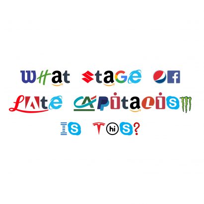
The Brexit Party will receive a lot of votes in the UK's upcoming European elections thanks to clever graphic design, says Ben Terrett, the designer behind the award-winning gov.uk website. More
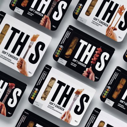
London design studio Johnson Banks has created a visual identity for new meat alternative brand This, aimed at flexitarians wanting to reduce their animal consumption. More
Chinese e-commerce giant Alibaba has released a new custom typeface that its partners, sellers and consumers can use free of charge to establish their own brand identities. More
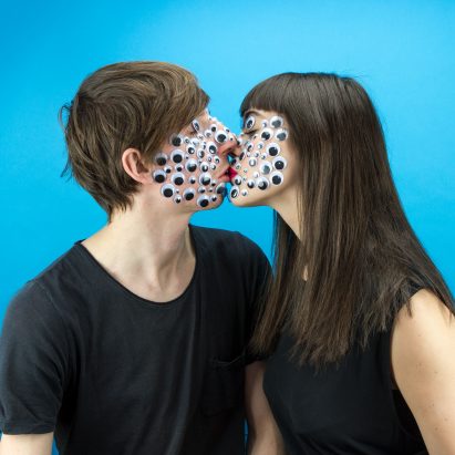
Brooklyn design duo Wade and Leta are out to show how design can be more fun. The pair talk Dezeen through five of their favourite projects, ranging from a series of idiosyncratic couple portraits to an alternative Valentine's Day party. More
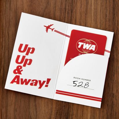
Lettering used in Eero Saarinen's 1960s TWA Flight Center at John F Kennedy International Airport in New York provided the cues for the branding of the new hotel in the terminal building. More
Creative agency Creuna Norway has worked with citizens of Oslo to create a new visual identity for the city inspired by its buildings and history. More
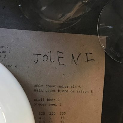
Lettering scribbled by the young son of graphic designer Frith Kerr provides the logo for north London restaurant Jolene. More
Letters overlap one another in the new logo for Spanish fashion retailer Zara, designed by French agency Baron & Baron, prompting criticism from fellow designers. More
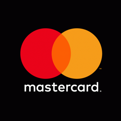
Pentagram has removed Mastercard's name from its logo, meaning the credit card company will now use only the red and yellow intersecting circles as its brand mark on cards and at physical and digital retail payment points. More
A logo resembling "stencil letterforms" is printed on the exterior of the Diller Scofidio + Renfro-designed art gallery on Boston's waterfront, as part of a major branding overhaul by graphic design studio Pentagram. More

Pentagram and Map have set out to prove that computer hardware doesn't have to be "cold, dark boxes", by designing colourful products for machine-learning technology startup Graphcore. More
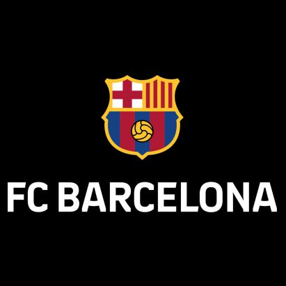
Brand consultancy Summa has subtly re-designed FC Barcelona's badge, and created a new personalised typeface and visual system for the football club. More
Uber has scrapped its controversial and confusing "asshole" symbol for a simple wordmark, as part of its new visual identity designed with branding firm Wolff Olins. More
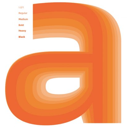
With companies rebranding at a rapid rate to stay ahead of the competition, designers are constantly devising new fonts and typefaces, we're looking back at 10 standout examples featured on Dezeen. More

Pentagram's New York office has updated the visual identity for America's Library of Congress in Washington DC, with a shape-shifting logo that resembles stacks of books and bookends on a shelf. More
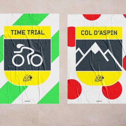
Road markings, race jerseys and crests informed the new visual identity for Eurosport's cycling coverage, designed by creative agency DixonBaxi. More
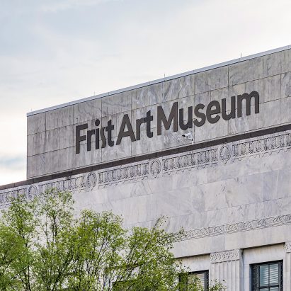
Pentagram's Austin studio has included an "art deco-style" letter S in this new identity for an art museum in Nashville, Tennessee, taking cues from the 1930s building it occupies. More
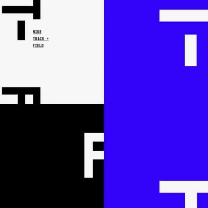
The arrow markings found on athletic tracks form the basis of Studio Build's updated visual identity for Nike's Track + Field clothing line. More